Posts

Project Tundra Cont...
Image
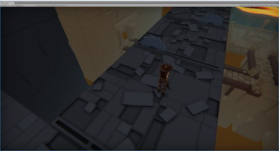
Been a short while since I posted about my dungeon crawler: Project Tundra (Mainly due to new PC and refactoring some code base which wasn't too exciting tbh) I've changed the original character to a female hunter for now, the animations are in a pseudo state of setup, but the code base for her movement has changed and now it plays a lot smoother - Committing to the point and click to move, the character follows the direction of the mouse if held down too. I'm attempting to showcase are more pleasing aesthetic on the level design, adding a depth to the levels to make them more interesting when passing through. Simple enough to do in theory, but getting the right feel will take quite a few iterations. A few screenshots below showing a few added "levels" utilizing the XYZ axis a little more when creating the initial layout of the levels. In addition, I decided to tinker with the unity particle effects to create a portal VFX (In conjunction with

Total War: Warhammer Map Creation (continued)

Image
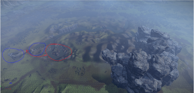
A small update from my last post regarding my map for total war: Warhammer. I've added some aesthetic improvements as well as some layout changes for gameplay reasons. Mainly the "left flank" of the map has been reworked, moving the small end of the river into the lake region to improve visuals. The may reason for changing the "left flank" is to draw players attention to that side of the battlefield as an alternate route of attack, but more clearly (It was usable before, but squeezing through 1 unit at a time wasn't fun - naturally. This area of the battlefield now houses several large rocks and a dragon skeleton. Ideally, this is visible - clearly - from most places on the battlefield, to draw the attention of the commanders to utilize this region, in addition to the bridges. As mentioned above, the red section was moved from left to right and now sits within the previously empty "lake/pond" - The areas in blue have been added, with some

Total War: Warhammer Map Creation

Image
I decided to have a go at map making again, it's been a long time since I've had a crack at a new map editor/game engine. And what better engine that Terry! (The Terrain Metadata Editor). After quickly getting to grips with the editor I started making an overly large map for standard pitched battles. The editor boasts a huge plethora of assets to cater to a designers desires for theme/pacing/visuals and so on. After playing a good many hours in Total War, the general map layouts are relatively simple at a glance. A few small caveats to take into consideration when creating a map. Map Size  Player Size (1v1 / 2v2 / 4v4 ) Balance Interesting terrain deformation ? Map size is relative to player size, naturally. The more players on a map the larger the battlefield can be, and thus the better utilized the terrain elements can be (Having a 4v4 with 1 choke point would be a mostly boring match, watching 1 unit fight 1 unit until someone runs out of troops). Adding in

Asset Placement 101

Image
I say 101 but it's pretty basic and not ironclad by any stretch of the imagination - For all intents and purposes this is the most primitive design ideology/common sense that should be utilized when making levels - I'll stress the point here this is why we do a quick mock up level! when I started my original block out of what I wanted the level to look and feel like I started running into the basic issues that always arise; a few of these are generally aesthetic but a select few are general design principles - Let's examine: This was the first pass of an elevated stairway - the main issue is apart, think of this as a third person or even isometric game, what would the first thought be around the circled areas??? Space!? There's a lack of it for sure. Given the size of the room, the character, the enemies, puzzles and environments etc etc etc, there will be little space to move around/up the stairs without causing some obvious issues. Now this is of course dep

Embed The Narrative! And the mechanics?

Image
Embed The Narrative!  And the mechanics I guess!  Something I enjoy doing a lot with assets is to embed them into the narrative, again this is simple stuff but often times it goes unnoticed. If done well it pays off in the long run, though this is often limited to assets available when creating levels (in this case I don't have loads). This method of asset placement or mechanic introduction can help teach the player without being intrusive about it. Here's an obvious example: Now this is the most rudimentary example of embedded narrative; a dead corpse propped against a wall. First thoughts on seeing this from a players perspective are generally: "eh a dead guy" or "that's interesting" - a few other thoughts are likely related to why the corpse is there/what happened to it/can I loot this etc etc. This can be used to a heightened degree later on, and be more inconspicuous, for example - if you were to create a boss room later on with say a l

...here's the rest of the lighting post...

Image
for some reason blogger is limiting me to display 2 gifs per blog post when I embedded. Anyway, here's the final shot I decided I liked the lighting with, though it will require a polish pass at some point, i feel it works quite nicely for the most part, though this might be to to starting/tweaking it for ages.

More Lighting...

Image
So, I decided I liked the flames, and there will likely be braziers of flames/fire or candles and such throughout the dungeon, as such, i wanted to try some lighting to help add some "immersion" of sorts. Now, this will take more work, but the general idea is there for "flicking lights" The script essentially adjusts the intensity/bias/range of the the light source it's attached too, needs some work here but it stabilises out at the end somewhat. Here's what happens when it goes wrong...