Asset Placement 101
I say 101 but it's pretty basic and not ironclad by any stretch of the imagination - For all intents and purposes this is the most primitive design ideology/common sense that should be utilized when making levels - I'll stress the point here this is why we do a quick mock up level!
when I started my original block out of what I wanted the level to look and feel like I started running into the basic issues that always arise; a few of these are generally aesthetic but a select few are general design principles - Let's examine:

This was the first pass of an elevated stairway - the main issue is apart, think of this as a third person or even isometric game, what would the first thought be around the circled areas???
Space!? There's a lack of it for sure. Given the size of the room, the character, the enemies, puzzles and environments etc etc etc, there will be little space to move around/up the stairs without causing some obvious issues. Now this is of course dependent on several other factors I wont go into too much detail (Think AI pathing/Getting stuck etc). These sort of "issues" are the exact reason white boxing/prototyping exit. Sure it might look fine at a glance the first time round but attempting to play this will bring these sorts of issues to light straight away.
A simple fix really:

Increasing the space between the wall and stairs will give ample room for the player and any NPCs to interact without too many issues, it will stop small issues such that would make "cheesing" the particular room, such as blocking enemies from surrounding etc - of course there's workarounds for that code side, but this is a simple and obvious solution from a purely primitive aspect, basic stuff!
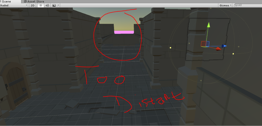
Here's another example of the corridor before this room was mocked up:

So my initial issue with the above image is again straightforward; It's too....boring. There's too much space and not a lot going on here. The player can see what's ahead and while in some instance(s) this can be good, in this one and most for that matter it's not really ideal.
Let's add some context here: the corridors are quite narrow, the opening to the right leads to where start area for the player. When they arrive at the location above they will have several options, to go through the door on the left (in front of them at this point) or to turn left/right - The right turn will show the above image with whatever room I decide to place there - Initial thought process dictated what I wanted to happen in this room, initially some NPCS to fight (introductory mechanics) and a puzzle element. Not something I want the player to see at a long distance, suspense of opening a door, or the option to have cutscenes here are something that should be considered.

Another simple fix: Limit the player vision. Placing new walls/doorways will add a simple element of "what's in the next room" - Again simple stuff that can incorporate new mechanics: 'How will the player open the door', 'What's on the other side of the door?', 'Should I go through this door or turn back?' etc etc etc. I enjoy this element of design and find most of this second nature when reiterating levels I've made, though this is mostly from practice and learning from my mistakes. I'll say it's a poor design if you settle for the first iteration of a feature/level/mechanic etc.It can always be improved and often times the first iteration is a quick pass to get a "feel" for the idea.
when I started my original block out of what I wanted the level to look and feel like I started running into the basic issues that always arise; a few of these are generally aesthetic but a select few are general design principles - Let's examine:

This was the first pass of an elevated stairway - the main issue is apart, think of this as a third person or even isometric game, what would the first thought be around the circled areas???
Space!? There's a lack of it for sure. Given the size of the room, the character, the enemies, puzzles and environments etc etc etc, there will be little space to move around/up the stairs without causing some obvious issues. Now this is of course dependent on several other factors I wont go into too much detail (Think AI pathing/Getting stuck etc). These sort of "issues" are the exact reason white boxing/prototyping exit. Sure it might look fine at a glance the first time round but attempting to play this will bring these sorts of issues to light straight away.
A simple fix really:

Increasing the space between the wall and stairs will give ample room for the player and any NPCs to interact without too many issues, it will stop small issues such that would make "cheesing" the particular room, such as blocking enemies from surrounding etc - of course there's workarounds for that code side, but this is a simple and obvious solution from a purely primitive aspect, basic stuff!
Here's another example of the corridor before this room was mocked up:
So my initial issue with the above image is again straightforward; It's too....boring. There's too much space and not a lot going on here. The player can see what's ahead and while in some instance(s) this can be good, in this one and most for that matter it's not really ideal.
Let's add some context here: the corridors are quite narrow, the opening to the right leads to where start area for the player. When they arrive at the location above they will have several options, to go through the door on the left (in front of them at this point) or to turn left/right - The right turn will show the above image with whatever room I decide to place there - Initial thought process dictated what I wanted to happen in this room, initially some NPCS to fight (introductory mechanics) and a puzzle element. Not something I want the player to see at a long distance, suspense of opening a door, or the option to have cutscenes here are something that should be considered.

Another simple fix: Limit the player vision. Placing new walls/doorways will add a simple element of "what's in the next room" - Again simple stuff that can incorporate new mechanics: 'How will the player open the door', 'What's on the other side of the door?', 'Should I go through this door or turn back?' etc etc etc. I enjoy this element of design and find most of this second nature when reiterating levels I've made, though this is mostly from practice and learning from my mistakes. I'll say it's a poor design if you settle for the first iteration of a feature/level/mechanic etc.It can always be improved and often times the first iteration is a quick pass to get a "feel" for the idea.
Basic Logic
Designer Thoughts
While I know all of this is 'obvious' and logical, I want to start making it apparent some of the small caveats that are to be considered when designing levels, mechanics. This thought process staggers and essentially becomes increasingly complex the further the development of the game goes (For the most part).


Comments
Post a Comment